A crash course in logos so you can sound like an expert when you commission your company logo.
A crash course in logos so you can sound like an expert when you commission your company logo.
You’ve decided you need a custom logo for your company or organization. If you came here from our previous blog on why your business needs a custom logo, you know the reasons you need it and where you should get it. Check that blog. It’s chock full of good info on how logos function and how people interact with them.
Allow me to take you on a guided tour of the world of logos from the perspective of a logo designer.
But what do I know?
Turns out, quite a bit! Here’s a quick bio so you know I am not just another YouTube-watching non-expert regurgitating other people’s ideas. I’ve been a professional graphic designer and copywriter for more than three decades. Much to the dismay of my long-suffering and practical mother, I went to school for this stuff! A collection of cool local, regional, and national awards in both disciplines is on my bookcase and stuck to my walls.
After college, I skidded sideways into marketing and strategy. To this day, I maintain an unusual career that mixes the creative and strategic. I focus mainly on start-up and early-stage companies. Education is a real passion of mine. I teach design, copywriting, and digital marketing to adults and high school students in Florida. (More about me here, if you are curious and not a bizarro stalker.)
In a nutshell, I know what I am talking about when it comes to logos and start-ups.
An insider’s look at the art and science of logo design
What’s in a logo?
Logos come in an infinite number of varieties. No two should look alike—if they do, at least one company and one logo designer have some ‘splainin’ to do! Uniqueness is critical in a corporate logo. That’s non-negotiable!
Common to all logos are the following physical characteristics:
-
- Style/type
- Format/layout
- Type (font)
- Color
Woven into these physical characteristics are intrinsic concepts that go into logo design:
-
- Uniqueness
- Simplicity
- Appropriateness
- Flexibility/Versatility
- Timelessness
- Memorability
- Reproducibility
- Explicit meaning
- Implicit meaning
I know my list of characteristics is different from most one finds online. It’s not that those others are wrong, but they fall short. The final three items on my list have proven vital to brand-building over my thirty-odd year career. Reproducibility, explicit and implicit meaning, are too often ignored when making a logo.
We will explore these topics in this and subsequent blogs.
Physical Characteristics
Styles/types of logos
By style, I mean the broad category of logo types rather than the artistic style. While there is some debate over how many types of logos are out there, I break it out by visual appearance. When I teach design, I tell my students there are five major categories of logos. But, buyer beware: some branding experts include more or fewer categories. Worse, they like to subdivide them into tiny subsets and add conditional definitions. That’s way, way overcomplicating the issue. Here is my list:
- Combination/Pictorial logos – a logo with an image and type
- Logotype logos – just type, usually with stylized letters
- Emblem/Medallion logos – looks like a shield or plaque
- Mascot logos – focuses on a character
- Illustrated logos – is a complex, usually realistic image that tells a story.

Let’s go over my definitions. Along the way, I will help navigate some overlapping, contradictory, or confusing terminology you might run into elsewhere.
Combination/Pictorial logos
Combination or Pictorial logos are the most common of all types. They are what most people think of as a “corporate logo.” You see this style for 60% of the Fortune 500 companies and most small businesses.
For simplicity, I maintain that pictorial and combination logos are the same thing: a combination of type and imagery. That makes it easy to understand!
Some define pictorial as the opposite of abstract imagery in a logo. You know, a bird that looks like a bird versus a swoopy suggestion of wings and a beak. But, that’s splitting hairs. Whether the image is abstract or representational, it’s still pictorial!
Multi-part logos
Others contend that a combination logo is one where the words and imagery can live on their own. For example:

I don’t like to call these combination logos. They are made to be un-combined, with the parts used separately. My preference is the older term, multi-part logos, with individual pieces referred to as brand elements. It makes more sense than calling it a combination logo.
Wordless logos
Some people define a pictorial logo as an image with no words. Rarely is a logo without the company’s name attached created as part of a primary brand image. That doesn’t work well. A brand element can stand in for a full logo if it fits the overarching brand strategy. Of prominent brand logos, 91% include a company name.
I can think of only one major brand whose official logo does not contain the name of the company. Starbucks’s logo is now just the mermaid. It is essential to note that this is only a recent development. For nearly 50 years, the word “Starbucks” was included in the medallion-style logo. In practice, the mermaid doesn’t exist in a brand vacuum. The company’s name is never far from the logo in ads or retail space.
I suspect the rest of that 9% of wordless logos followed the same pattern of brand-building before allowing an image to carry the load. Mcdonald’s and Chik-fil-A also have well-known logo images that stand on their own separate from the official brand name. Like Starbucks, though, the image and the name are almost always near each other.
Logotype logos
Logotype logos have no image, just type. The company name is spelled out, most often in a stylized fashion. This category further breaks down into
-
- letter marks (for organizations that use initials, like IBM or NASA),
- word marks (whole names), and
- monograms (shortened versions of the company name, like 3M for Minnesota Mining and Manufacturing).
Not surprisingly, not everyone agrees on what those terms mean, and there is plenty of overlap. So, let’s define it thus: logotype logos feature letters that identify that company. Examples include Canon, Oracle, and IBM.
Mascot logos
Mascot logos also have images, but they are more the central star of the logo than in a typical pictorial logo. Sports team logos often fall in this category. But other companies do, too. Note how the image of Colonel Sanders’s face and the brawny gator in Gator Fitness dominate their respective logos. Meanwhile, the Lacoste logo’s crocodile is subordinate to the company name. The croc takes a back seat while the gator is driving the image.

Emblem or medallion logos
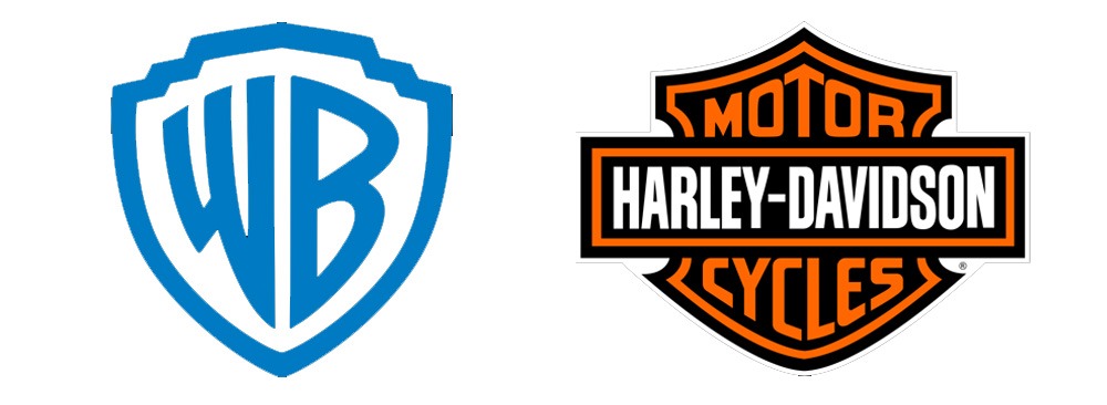
Emblem or Medallion logos are badge- or shield-like. Starbucks, Warner Brothers, and Harley-Davidson are good examples. One thing to note is that they can take up a lot of space and might not work so well in tiny sizes.
Illustrated logos
Illustrated logos tell a story or depict a scene that describes the organization or product. They lend a homey, historical, or retro feel to outdoors-related products, campgrounds, and hotels. Food-related products, particularly traditional or artisanal ones, vineyards, and restaurants, also do well with this kind of imagery. They are less common than other styles.
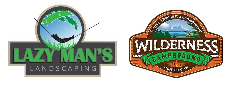
The Wilderness Campground logo is a classic outdoorsy illustrated logo. It shows images of what you’d expect to find at the venue. In the Lazy Man’s Landscaping example, the logo takes an unusual twist on the typical theme. Instead of showing the landscaper cutting grass, it depicts the person who hired the service enjoying his lush backyard in a hammock surrounded by tropical vegetation.
Logo Format/layout
Not all logos are laid out the same way. Some are more horizontal or vertical, while others are square, circular, or pyramidal. There is no single best format. Layout preferences go in and out of style, often reacting to technological changes. Nevertheless, there are a few standard layouts that you will see today:
-
- Horizontal
- Vertical
- Square
- Round
- Pyramidical
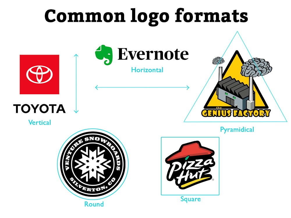
Flexible layouts for different applications
The trend for the past decade has been toward logos that would fit into square spaces often found in digital media. Windows for social media profile pictures are all square or round. Wide or tall images get cut off. While square or round logos work in most layouts, they don’t fit well in standard WordPress headers. There, a horizontal orientation excels.
One style does not work everywhere. The solution is a flexible-layout logo. At one time, this was frowned upon as a logo was considered an inflexible, unchanging symbol. Given the many formats logos have to fit today, a flexible-layout logo scheme is an excellent solution to problems of space.

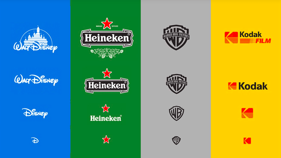
Responsive logos change with size
Responsive logos are now fairly common. These logos change their detailing depending on the size of the application. Below is an example of four well-known symbols in which different features become more simplistic as they scale down.
Can (or should) logos change?
Many online lists rank “timelessness” as a key feature of a good logo. While certain product logos, like those of Heinz, Coca-Cola, and Stella Artois, remain relatively unchanged after decades or even centuries of use, most undergo periodic redesigns. Universal Studios changed its logo 12 times since 1914, most recently in 2012 (Closing Logos, 2020). That’s more than once a decade!
Starbucks is well known for its logo’s evolution over time. This restaurant logo has evolved since its first version but has never lost its essential character.
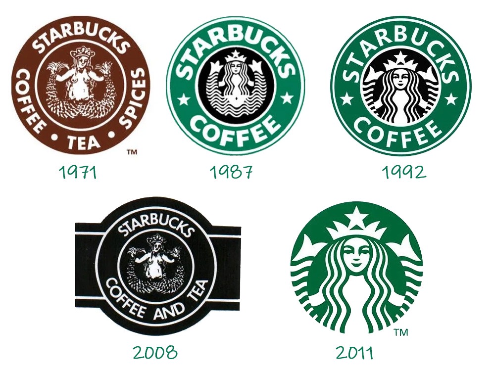
Note the retro look Starbucks attempted in 2008. This move back to an older logo met with considerable negative feedback from Starbucks clientele. That’s why we have the wordless mermaid of today!
A brand is eternal but a logo is not
Established companies revisit and redefine their brands every 7 to 10 years. That includes logos, colors, messaging–everything public-facing. So don’t be surprised if you have to do the same.
That’s not to say that you should settle for less now and plan to fix it later. Big mistake! Make a logo that will last forever because the cost of changing it can be considerable. You will spend a fortune chasing down and replacing every instance of your old logo while risking your brand identity in the marketplace. Remember, most rebranding is subtle, not catastrophic, and builds on a solid foundation.
How will you use your logo
Will your logo work in all settings? Make sure you get a design that is flexible and versatile. Plan for signage, business cards, vehicles, websites, hats, and shirts. Your logo must fit on, in, or around various locations. In the final installment of the logo series, we will learn that not all reproduction methods are created equal. Screen printing a logo on a shirt does not allow the same range and depth of colors as a digital presentation on a website. That’s why fewer colors are often better, and a one-color version is mandatory!
Imagery in logos
Images vs. suggestions of images
Logos often contain graphical symbols that are part of the broader set of commonly understood icons and symbols. A logo may include classic symbols, such as arrows, stars, smiles, or hearts to underscore aspects of the company.
The FedEx logo cleverly suggests an arrow in the negative space between the E and X. It suggests the movement of packages. Note the arrow points from left to right. Pictorial elements that look or move to the right are seen as forward-looking, optimistic, accessible, open, and positive. Leftward-facing images are perceived as introspective, reflective, and past-focused. This directional concept is true in logos, portraits, and just about all visual media in western cultures.

Amazon’s logo has an arrow that does triple duty:
It is a forward-facing arrow suggesting action and movement of packages.
The arrow points from A to Z, stating that the online store has everything from A to Z.
Finally, the arrow forms a smile. Happy customers!
I wish I had thought of this one!

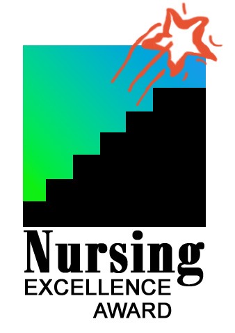
Florida Gulf Coast University’s Nursing Excellence Award program’s logo combines a classic image of stairs with a star, both loaded with understood meanings. After putting in the hard work of climbing the stairs – analogous to working one’s way up in the nursing profession – one reaches a level of a star, achieving excellence and success.
Some professions have icons that are often associated with them. Using them can help build an immediate bridge in the public’s mind about what the company does. Be careful, as you risk overusing what is probably an already overused convention. Here are four examples that use classical symbols in ways that put a twist on the typical.

Classical pillars often represent government, education, and legal subjects. In the Camadeco & Forrest law firm logo, we incorporated the initials of the law firm’s partners into the decorations on the ornate Corinthian-esque column. Columns form uprights for attorney Nathan Adler’s initials.
These two examples use education icons: the apple and the mortarboard. In the School Resource Center, rotating arrows borrowed from the recycling symbol form an apple. This image kills two contextual birds with one visual stone by suggesting recycling in an educational logo.

The mortarboard in South Africa’s Virtual Tutor logo indicates graduation. Combined with the image of a computer monitor, the message is clear: online and computer-based tutoring for educational success.
Custom images can become icons
The Nike brand logo, the swoosh, one of the most powerful corporate symbols in history, is simple and abstract. It is also inherently meaningless. It has no real parallel in cultural, religious, or ethnographic iconography. Millions of dollars of advertising money have gone into building an association in the public mind of what that symbol means—and it isn’t just “running shoes.” It suggests “grit, determination, never-say-quit, Just Do It™.” Compared to, say, an illustration of a guy wearing running shoes, how much more flexible and valuable is the swoosh?
The takeaway here is that the powerful meaning of the Nike swoosh is not inherent in the swoosh. It was bought and paid for over decades of consistent, well-planned, well-funded advertising and marketing. Most companies cannot afford this!
Structure and format takeaways
Now, you should know what kind of logo you want for your organization, team, product, or company. With an understanding of the function of different layouts and the parts of the logo, you can decide how you want your logo to look. Some formats work better in specific settings, so make sure you project into the future when thinking about what you will do with your logo. Always plan for change. Your expected use today may not match what you do in a year or two. Digital marketing moves too fast for a company to think it is riding the top of the wave.
In part 3 of our logo installment, How to speak the secret language of logos, we will go into color, typeface, and explicit and implicit meanings in logos. After type and format, these are the most important considerations for your logo’s success.
Bibliography
https://financesonline.com/logo-statistics/
https://oit.williams.edu/files/2010/02/using-images-effectively.pdf
https://research-collective.com/human-factors-history-designing-stop-sign/
https://www.bbc.co.uk/bitesize/guides/zsv9fcw/revision/1
https://en.m.wikipedia.org/wiki/Swoosh#
http://www.irenses.ie/2009/12/16/christmas-shopping-in-the-19th-century/

About the author
Richard Williamson has enjoyed a three decade career in marketing, advertising, and public relations. Formally trained in graphic design and copywriting, he is a partner here at BackBurner Marketing and founder and lead designer of the Logo Design Group. Find out more about him here or at www.RichardWroteThis.com.
Richard is available for brand and marketing consulting, business coaching, and as a fractional Chief Marketing Officer.
