How to speak the secret language of logos
Logos speak a secret language that says a lot about your business without using any words!
When your eye catches sight of something in the environment (such as logos), it jumpstarts an ancient, subconscious process in your brain. The result is an unshakable, often unchangeable opinion of that object. It could be a diamond ring, chicken casserole, or sabertooth tiger emerging from the bushes.
This process comes as standard equipment with each human brain.
For most of us, life and death decisions don’t happen on a daily basis. But our brains do not turn off that instinctual evaluation system, asking continuously, “Will this thing eat me?” And if not, then, “Can I eat this thing?” It stays on, prepared at all times just in case a lion or lunch appears. Meanwhile, it fills the time between terrified sprints to safety with animal-level evaluations of everyday objects.
Like business logos.
As a marketer, designer, or business owner, you need to understand how this works so so you can communicate with your audiences on the most basic level.
Humans have basic wiring
Modern humans don’t understand–or like to admit–that much of their everyday functioning is built on the foundation laid by their primitive ancestors. It’s for your own good that you work this way. And it is unavoidable.
Just because you have a college degree or drive a Ferrari doesn’t mean that you’ve evolved past the point where your brain interprets a red burner on the stove as, “Hot!”
And I’ll bet you big money that that Ferrari is also red. Why? Because red means hot. And sexy. And exciting.
The car itself? That means wealthy.
Or it could mean this: “I am a YouTube influencer renting it for the day, so you THINK I am hot, sexy, and rich.”
Either way, poor human, visual cues cause your brain to develop unshakeable, often unchangeable impressions. And impressions mean a lot.
Humans have exceptional cognitive abilities–the problem is that they don’t use them immediately. First, the brain works on a primitive level, picking up and processing tiny details on the fly. Speed counts. Some of these cues alert our basic survival instincts. Others trigger deep-seated cultural, religious, or learned constructs. It all makes up the sixth sense, your gut feeling.
How does this translate into logos?
Everyone’s first reaction to any visual stimulus is visceral. After seeing a work of art or logo, people will almost always describe how it “feels” to them.
-
- Red heart, we think “romantic.”
- Pink heart, we might say, “Hm, that’s sexy.”
- Green heart…”Huh?”

Is this St. Patrick meets St. Valentine? Why? What does it mean?
It’s a confusing message. Green hearts don’t fit into most human constructs or match cultural references. So, subconsciously, the viewer might be suspicious of this image.
If your company sells Valentine’s Day candies or lacy underthings, you can use a pink or red heart to good effect. The green one will likely not boost sales this quarter.
Explicit vs. implicit messages
Every marketing image, from logos to brochures to websites, conveys two types of messages: explicit and implicit.
The explicit message is the face-value meaning of imagery and words. The image of a hamburger suggests fast food. A steel belted radial says, “Tire shop.” A bowling pin can only mean a bowling alley.

I purposely picked examples that are straightforward and unambiguous. There isn’t a lot of hidden meaning behind a tire and a bowling pin.
But what about stairs or a ladder? Or a globe? Or an arrow?
An implicit message is a suggested meaning rather than a literal one. In the fictional examples below, the same typeface and graphical icon is used to send different implicit and explicit messages.

Based on the name of the company, the ladder in the LADDERS Inc. logo, is likely part of an implicit message. Central Addiction Services and United Career Counselors also include ladders in their logos. But it’s evident by context that these ladders are symbolic.
Ladders help us climb up or provide rescue to someone trapped up high. With a ladder, someone can escape the depths of addiction or ascend the corporate ladder. Ladders, Inc. sells ladders. Central Addiction and United Career sell self-improvement for a better future. Same imagery, two different meanings.
Note that these business names use colors that add to the implicit meaning of each logo. Brown signifies “wood” used in the ladders. Purple is the color of addiction awareness. And green is the color of growth. Color, as you will see in the fourth installment of this series, is another fundamental element of messaging.
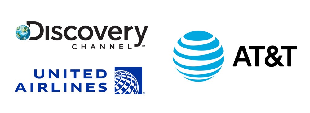
Globes and spheres are common symbols used in logos. And they have lots of meanings, too. Most commonly, a globe is a symbol of global or international scope. It can also mean perfection, equality, and suggest an all-encompassing or expansive organization. The Discovery Channel’s globe is not abstract. It is the earth. It speaks to science worldwide, the planet and its nature. United Airlines’s abstract globe clearly defines the airline’s service area: everywhere! AT&T is a global telecom company, and the lines around it symbolize how the company unites countries all over the world.
Arrows suggest direction, travel, movement speed or accuracy. When used in logos, these implied meanings help convey something about the company that is not literal.
Subway has two arrows in its logo. They are reminiscent of arrows often seen in public transport stations. They also represent speedy service (though, from experience, I have to say this is a bit of wishful thinking). These are not random, accidental ideas. It’s part of the corporate messaging. According to Subway president and CEO Suzane Greco, “The Subway brand is recognized throughout the world, and this (symbol) reinforces our commitment to staying fresh and forward-thinking.” (via Business Insider).
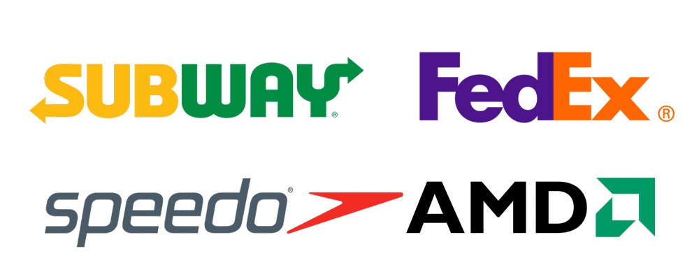
Computer chip manufacturer AMD’s logo is a festival of stylized arrows. The symbol next to the letters AMD (which is set in the Gill Sans typeface, by the way) is two arrows that combine to make a third. This combination of arrows symbolizes movement, but also development, forward-looking, and omnidirectional progress. They also form a lower case letter A as a secret feature.
On the topic of secret images, we discussed the FedEx logo in installment 2 of this logo series, Everything you need to know about logos but didn’t know who to ask. It features a hidden arrow between the E and X. Speedo’s arrow is more abstract thanFedEx’s, but it has the same connotation: movement. The red arrow lets us know it is fast movement.
Not surprisingly, the movement in the FedEx, Speedo, and AMD logos is from left to right. As you learned in the blog Everything you need to know, this is based on psychology and cultural traditions that tell us rightward movement is forward-looking and positive.

Many symbols are universal
Symbols and icons communicate quickly. Sometimes, the simplest of symbols convey a complex idea. Among the most universal symbols is a circle with a slash through it. No matter where you are, it means “NO” or “FORBIDDEN.”
Taken at face value, this symbol could mean “no cigarettes.” But we all know it means no smoking. Used worldwide, the no smoking symbol needs no words to get the point across.
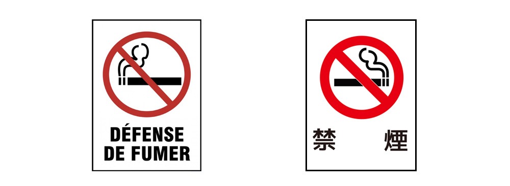
Even if you don’t speak French or Japanese, when you see that symbol with the words “défense de fumer” or 禁 煙 (kitsuen kinshi) under it, you can infer it means “No smoking.”
Words help bring the message home
As we learned in the first installment of this three-part logo series, Why your company needs a custom logo (and how to get it), the human mind processes images 60,000 times faster than text. The initial impression of a logo comes from its visual impact.
But that’s only part of the whole picture.
Almost without exception, words in a logo are the name of the company, team, or organization. Nothing identifies a logo more than the name of the company itself! The words can also help clarify the meaning of the accompanying imagery.
In the ladder example above, the ladder image provides clues about the company. At the same time, the company name helps clarify the meaning of the iconography. It isn’t difficult to determine which of those three companies sells ladders and which have a symbolic connection to the icon.
Images, names, and slogans
The ButtKickers logo includes an image of a smashed cigarette. The visual itself says, “Extinguished cigarette.” It could be an ashtray company, maybe? But the company name suggests more. Butts are cigarettes. We kick habits. The company helps people stop smoking.
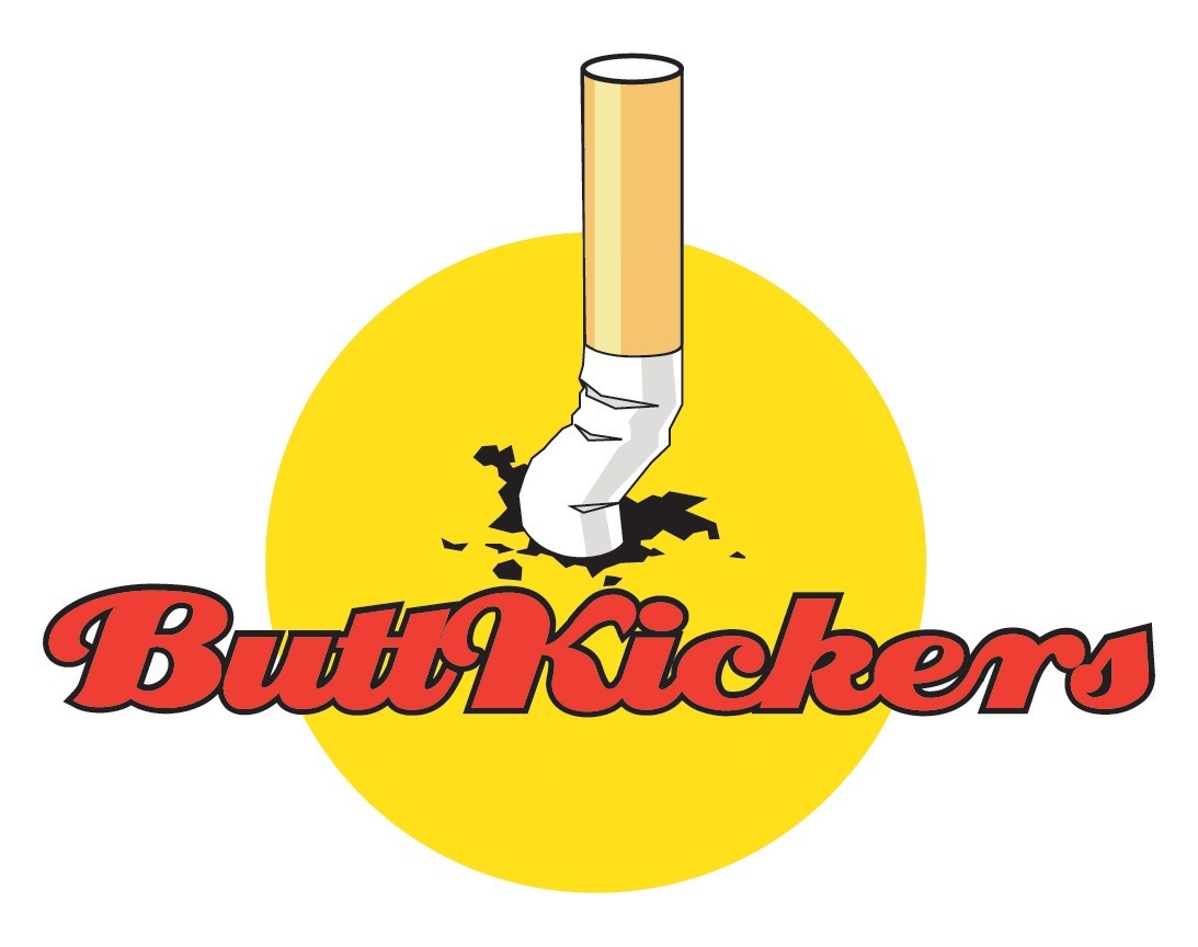

In this case, adding the company’s slogan or tagline further clarifies the company’s mission.
Putting a tagline under a logo is quite common. Ideally, the slogan is a clarifier. A good logo should not require a slogan to define the company.
The sum of its parts
As you’ve seen, pictures and symbols work together to define a logo’s message. What matters most is that the message conveyed is clear, simple, and unambiguous. It’s also essential to ensure that the logo jibes with your product’s or service’s overall messaging.
Businesses can make messaging easy to understand by using classical icons or an illustration clearly showing what the company sells or does.
If you fancy more abstract imagery, be prepared to educate your target market. The more abstract the imagery, the more critical it is to tie slogans and other identifiers to the logo. At first—and possibly forever—that means keeping taglines and other messaging elements in close visual proximity to the logo itself.
In all cases, it’s essential that your colors and typography align with the overall message you’re trying to convey.
Typography 101
Type style and color are the two most memorable physical characteristics of a logo. You learned about the main types and layouts of logos in the second installment of this logo series, Everything you need to know about didn’t know who to ask. Now let’s look at typography.
The advent of the personal computer completely changed the graphic design landscape. The mainstreaming of what was once a relatively obscure skill has raised the quality of casual design work. At the same time, some of the terminology of the profession has been confused.
What the font do you mean?
So, to ensure we are speaking the same language, here is a basic lesson in typography.
Those letters in a design or document…that is “type.” The style of that type (like Times New Roman or Arial) is called a typeface, and variations on it (e.g., bold, italic) are fonts. The terms “typeface” and “font” are not interchangeable. They’re two different things.
What most of you call a font is actually a typeface. Think of a typeface as parents in a family. A typeface can have several different fonts. Those are the kids. Some kids look a lot like the parents, some don’t.
A font is basically a variation on the typeface. For example, Ariel is a typeface that might have condensed, italic, and bold fonts.
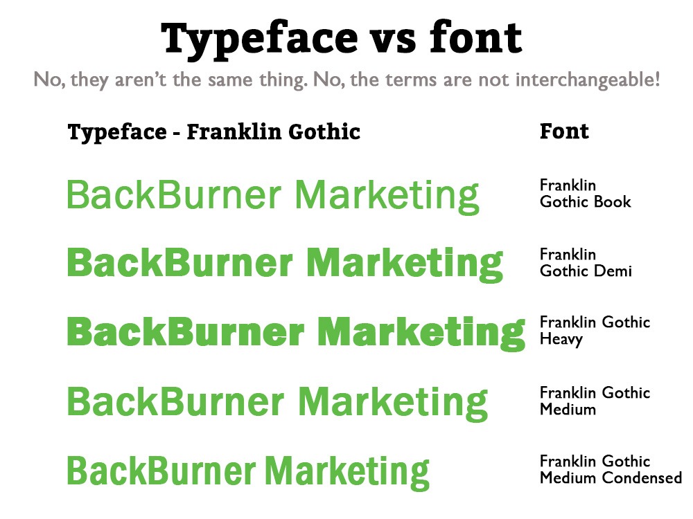
There! Now you can sound smart when you talk to your designer about type! Trust me. You will impress the heck out of the typical artist.
Broadly speaking (and to oversimplify a bit), typefaces come in two flavors, serif and sans serif. Serifs are the little feet you see in Times New Roman but not in Arial. The purpose of serifs is to help your eye move from left to right across a paragraph.
Serifs were derived from the letters used on Roman buildings. As a result, after several centuries of continuous use, serif typefaces come to imply classical reliability, tradition, and trustworthiness.
Footless typefaces are called sans serif and derive from Caslon, a face invented in the early 1800s. Futura came along a century later. It was used everywhere. Then, in 1957, Helvetica became the undisputed king of the footless universe.
Futura has books and dissertations written about it. But Helvetica is so famous and important that it is the only typeface (to my knowledge) to have inspired a documentary. If you are a typeface nerd like me, Helvetica (2007) is a delight. Not only does it make type into a darned sexy subject, but it also shows you how much of your everyday experiences are shaped by the inescapable Helvetica face. (And graphic designers, who secretly control the world. Don’t tell anyone.)
There is a good chance that every logo designed today has some form of Helvetica or Futura in at least one draft version. Don’t let your designer use Arial. It’s clunky and inelegant.
What difference does typeface make?
The typeface you use for your company name has a lot of connotations about the character of the company itself. See for yourself.
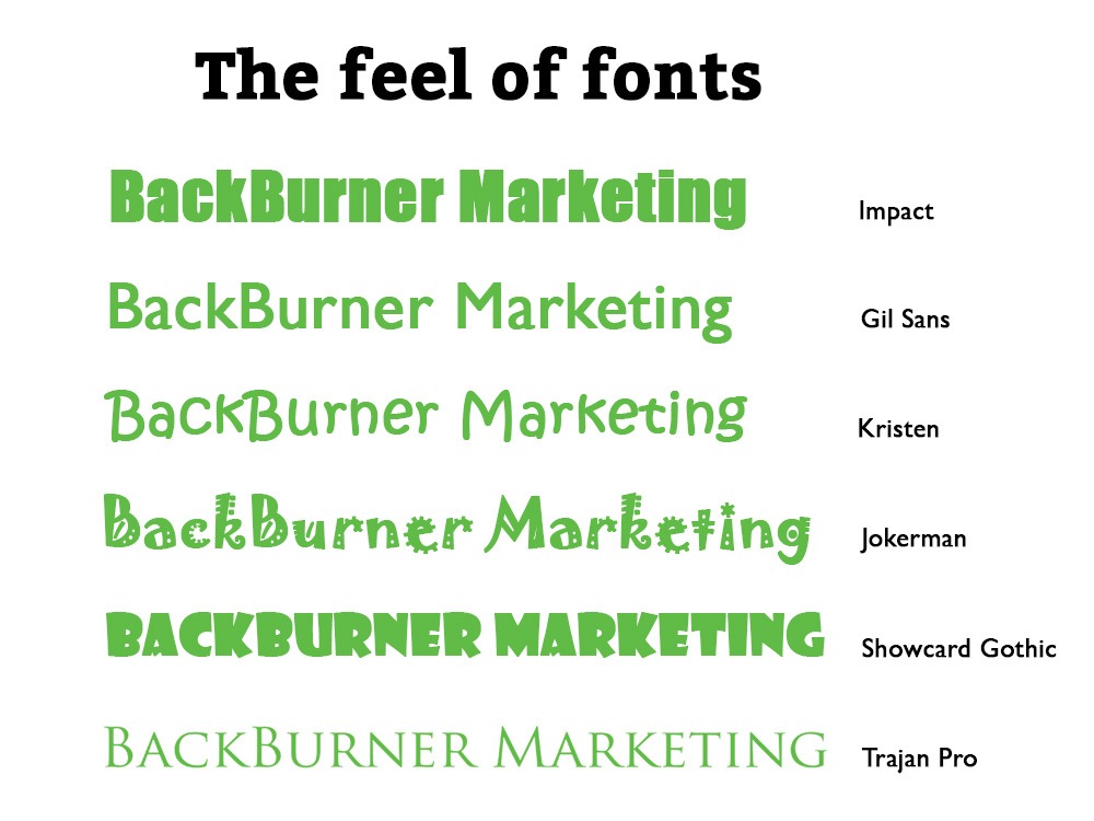
In the example above, you can see how different typefaces make a difference in how a logo is perceived. In the three examples below, you see my company name, BackBurner Marketing, written in several typefaces.
At the bottom is the typeface we use, Trajan Pro. It is not off-the-shelf. The typography was subtly edited in the “outline” or “curve” level, customizing how the letters fit together and are shaped.
(By the way, BackBurner Marketing’s sister company, LogoDesignGroup, is celebrating its 20th anniversary next year! Look for special offers from now through the end of 2023!)
The secret language deciphered
Crafting effective logos is a lot like dressing for a blind date. You want to make a good impression by picking the right clothes for the occasion. No doubt, you might be the nicest, smartest, most talented person in town and perfect for your date. But your choice to wear a tuxedo to the bowling alley, or cut-off jean shorts and a tank top to a formal ball, made a horrible impression. On everyone.
In the business world, there is no coming back from a bad first date. There are too many attractive fish in the sea, so your ugly, inappropriate self is going to be thrown back.
The typeface you use in your logo does more than just tell your business’s name. It makes a much bigger but far more subtle statement. The imagery you incorporate into your logo helps tell the story of who your organization is and what it does.
The last part of the logo equation is color. We will explore that in the final installment of this series, What do your logo colors mean?
Bibliography
https://financesonline.com/logo-statistics/
https://oit.williams.edu/files/2010/02/using-images-effectively.pdf
https://research-collective.com/human-factors-history-designing-stop-sign/
https://www.bbc.co.uk/bitesize/guides/zsv9fcw/revision/1
https://en.m.wikipedia.org/wiki/Swoosh#
https://www.mashed.com/617674/the-symbol-you-may-not-have-noticed-in-the-subway-logo/
https://s3.amazonaws.com/nacda.com/documents/2018/8/3/3795__icla__CharlieHenn.pdf

About the author
Richard Williamson has enjoyed a three decade career in marketing, advertising, and public relations. Formally trained in graphic design and copywriting, he is a partner here at BackBurner Marketing and founder and lead designer of the Logo Design Group. Find out more about him here or at www.RichardWroteThis.com.
Richard is available for brand and marketing consulting, business coaching, and as a fractional Chief Marketing Officer.
