The colors in your logo say a lot about your brand.
Color is an essential part of the human experience. We patriotically identify with the colors on our nation’s flag. Many of us passionately wear colors that match our favorite sports team. The color of our car or truck is a part of our self-image. To say we don’t see color (in the literal sense) is absolutely untrue. Color is as much a part of our understanding of the world as is sound and smell.
Logo colors are essential
Color is possibly the most essential aspect of a logo or any design. Colors can help improve brand recognition by 80%. (Touro Law)
Here is the breakdown of color usage in prominent international logos. These numbers add up to more than 100% because some companies have more than one color on their logo. (Venngage)
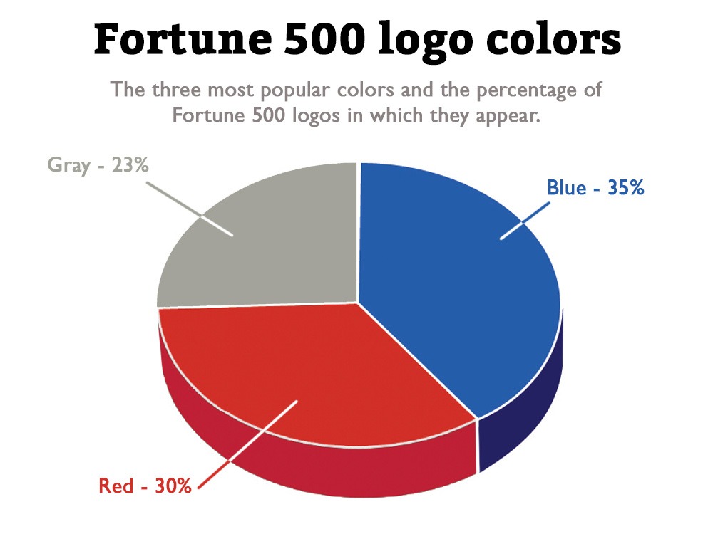
As you can see, blue, red, grayscale, and yellow make up the bulk of logo colors worldwide. But, before you rule out other colors, understand that this is Fortune 500 companies. They are the most successful companies in the world, but what they do is not necessarily correct for a new startup or mom-and-pop company.
For example, according to Venngage, only 7% of their sample had green in their logos. My company, BackBurner Marketing, is based in Florida. A few years ago, we executed a survey of local and regional companies that found 72% included green and 51% blue. Yellow and orange were also very popular for possibly surprising reasons. Yellow suggests sunshine. Orange is popular because many business owners are fans of the University of Florida, whose colors are blue and orange.
Beware brand conflicts
Choosing logo colors based on your favorite team might seem sensible. There is a kind of logic to it. One might conclude that the same team loyalty that inspired the owner to choose those colors might also lead a consumer to buy from that company. In areas of enthusiastic fans, showing support for the local team can forge a bond with the market that might not otherwise happen.
Logical, but risky. Courts in several cases have found that using college or professional team colors to lure customers can infringe on copyrights and intellectual property. There is a fine (and expensive) line between supporting your team and implying a relationship or endorsement with it.
It’s better to build your own brand rather than piggyback on someone else’s. Colleges and professional sports organizations vigorously and ruthlessly protect their colors and logos. So, be careful.
Which color is right for you?
Do you want to exude tradition? Blue. Excitement? Red. Happiness? Yellow. The spectrum of colors available in the digital world is nearly endless, so you are bound to find the exact color you need.
If your company sells plants or spring water, green and blue are obvious color choices that support the company’s profile. Not all color choices are so evident. Learning the meaning and psychology of color can go a long way to establishing a meaningful brand identity.
The meanings of color
Colors have meanings. As you’ve seen, some of these meanings are built into the human experience. We don’t pick up coals from a fire because red means hot. Other meanings are cultural. In the US, Canada, and Europe, we wear black to funerals and brides wear white. In India, white is customary at funerals and brides wear red.
Some colors have more than one meaning, and can conflict with each other. As you move from one culture, continent, or nation to another, color meanings can shift suddenly or dramatically.
Below is a chart of colors that was originally posted in a blog called Does Color Matter in a Logo, on our sister site, the LogoDesignGroup. That blog goes into the issues of color in great detail so you should hop over there to get the full picture (no pun intended). The chart gives you a view of the many meanings suggested by color.
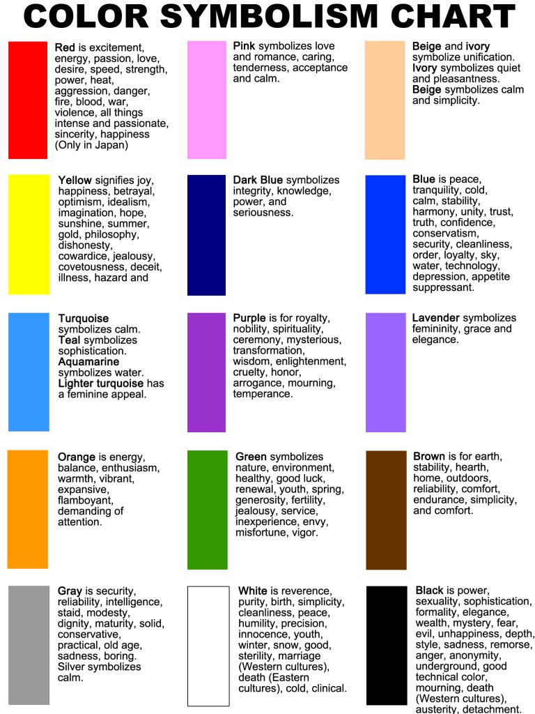
There are trends in colors by industry. You’ll see lots of green logos in technology, healthcare, agriculture, and “green” industries such as solar. Many banks rely on the stable and reliable connotation of brown and blue. Technology and restaurants often use orange. Those trends don’t mean you can’t use green for a bank or orange for a funeral home, but deviating from Norm has its own meanings.
A special note on color reproduction
Color reproduction is remarkably complicated. It deserves its own long blog post. The advent of digital printing and inkjet printers has created a false sense of how easy it is to print and reproduce color. Anybody can throw together a design and get it printed at Office Depot.
In a digital format, reproducing color is easy. Computer monitors, tablets, and mobile devices offer virtually unlimited color options. Once you step outside the uber-flexible (and forgiving) digital world, color reproduction becomes unexpectedly important.
Print ads in newspapers or magazines, brochures, and business cards all present different color demands. Black-and-white ads are far less expensive than color versions. Brochures can be printed digitally, so full color is not always an issue. If you use traditional lithographic printing (on a printing press), each color is printed using a separate costly “plate.” Full-color in that format requires four plates and is most often very expensive. Simpler litho printing jobs use a black plate plus plates of single “spot colors” to apply color to a logo or sections of a brochure.
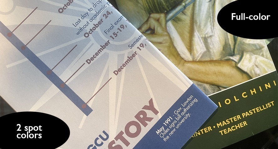
The brochures above are examples of spot-color lithographic printing (left) in which two colors are printed on white paper. The white paper almost appears to be a third color. The full color brochure allows near-photographic reproduction. A full-color logo will not reproduce in a spot-color environment. In the example below, the first image is a full-color with gradations. The middle logo is a two-color version of the same brand. The black-and-white version at right can be used in any printing technique.

Ad specialties, such as T-shirts, hats, signs, keychains, or water bottles, are even more restrictive when it comes to color applications. Most are screen printed in spot colors. Full-color is often not possible or prohibitively expensive. Your logo must have one-color and simplified color versions.
Designs stitched on a hat or shirt require a special “stitch file” format that tells embroidery machines how to structure stitching, thread colors, and direction to reproduce the image. Some logos are hard to reproduce, particularly at small sizes.

When you make a logo, keep these things in mind. Full-color looks great but may not work in all settings. Plan ahead when working with a logo designer to create a logo that will accommodate these scenarios.
How many logo colors is appropriate?
Don’t go bananas (yellow?) with your pallet. More than three-quarters of top brands have logos with only one or two colors. Google is a notable exception with four. But Google owns YouTube, which has only two. Which is right? Both.
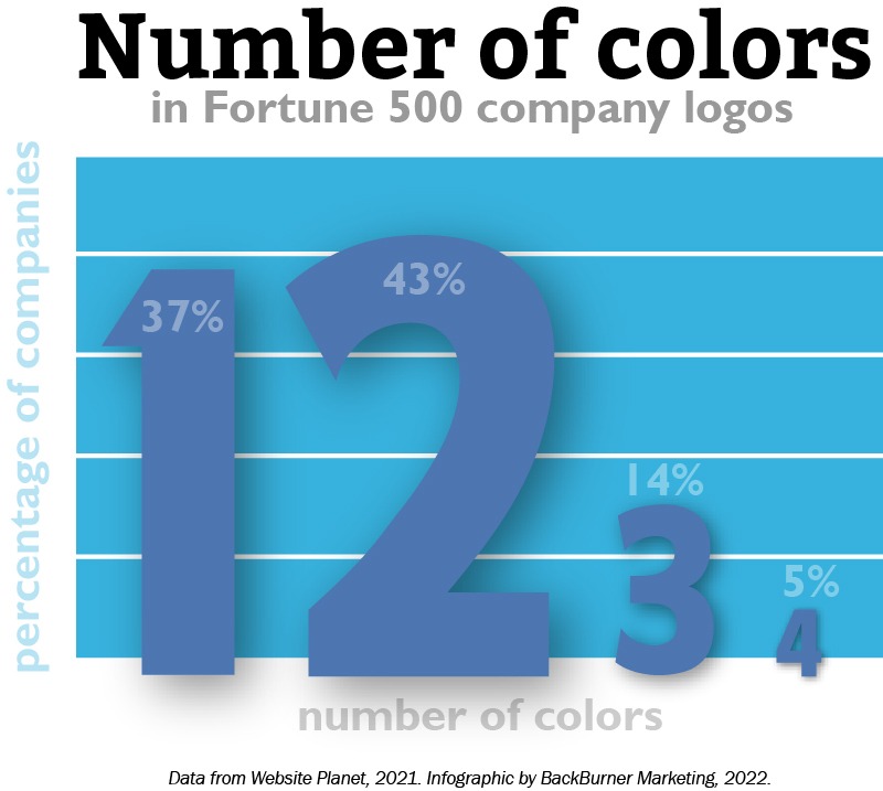
Too many colors and your logo starts to lose its meaning. Or it looks like a preschool. Neither is a good option…unless you are a pre-school of course.
Don’t just start a business. Build a brand.
One of the chief differences between marketers and other business people is their approach to business creation. Most company founders begin their businesses with the goal of making sales, bringing a product to market, or gaining market share. By contrast, 89% of marketers say that brand awareness is their top business objective (Review42, 2020).
An engineer or mechanic might start a business as a way to offer services. This is straightforward and not unacceptable. But a marketer goes beyond the mechanics of starting a business and into the essence of what a business is. This essence is the brand: the impression people have of a company, the way the phone is answered, the commitment to quality and customer service, and a desire to be environmentally or ethically focused.
This difference of focus often brings a degree of conflict in the business setting. Founders often find marketers to be distracted by nebulous ideas of “brand identity“ rather than focusing on growth and sales. Marketers, however, understand that building a brand lays the foundation for later success. Obviously, there has to be a balance between these two perspectives. A business without sales will not be around long enough to develop a solid brand reputation.
But start with a great logo that helps define the essence of what your company is and does. Build your brand identity from Day One. The logo is the central element around which every other visual element is built. Make sure the character of what you want your business to be is captured in that logo. Commit to it and build from that foundation. You cannot go wrong.
Enough reading. Start DOING!
You’ve got the low-down on what you need to make your logo great (if you missed the first three installments of this logo series, start here: Why your business needs a custom logo). You don’t have to be the artist. You can be the art director. But get started! Hire a designer and get some roughs in hand. Pick one.
But, as with any important decision in life, get a second opinion. Ask your friends. Think a lot. Make up your mind and jump in with both feet. Commit the bejeezus out of this and make your brand amazing!
Bibliography
https://financesonline.com/logo-statistics/
https://research-collective.com/human-factors-history-designing-stop-sign/
https://www.bbc.co.uk/bitesize/guides/zsv9fcw/revision/1
https://en.m.wikipedia.org/wiki/Swoosh#
https://graphicmama.com/blog/types-logos/#emblem
https://www.mashed.com/617674/the-symbol-you-may-not-have-noticed-in-the-subway-logo/
https://logos-world.net/amd-logo/
https://s3.amazonaws.com/nacda.com/documents/2018/8/3/3795__icla__CharlieHenn.pdf

About the author
Richard Williamson has enjoyed a three decade career in marketing, advertising, and public relations. Formally trained in graphic design and copywriting, he is a partner here at BackBurner Marketing and founder and lead designer of the Logo Design Group. Find out more about him here or at www.RichardWroteThis.com.
Richard is available for brand and marketing consulting, business coaching, and as a fractional Chief Marketing Officer.

